



Every founder we meet can tell us their acquisition cost. Very few can tell us what share of the people who sign up ever reach the thing they signed up for. That gap is where most product money quietly disappears.
The costs nobody files under design
When an interface is hard to understand, the bill arrives in departments that have nothing to do with design. Support answers tickets that are really navigation questions. Sales runs demos that exist because the product cannot explain itself. Engineering builds a feature twice because the first version was never findable. None of those line items say UX on them, so nobody traces them back.
One client arrived convinced they had a pricing problem. Trials converted at four percent and the obvious lever was the price. We watched eleven trial users instead. Nine never found the import tool, which was the one feature that made the product worth paying for. The price was fine. The second screen was not.
Why it gets misdiagnosed
Teams that build a product every day stop being able to see it. You know where the import tool lives because you argued about where to put it. Your user has thirty seconds and no context. That asymmetry is invisible from the inside, which is why internal debate never settles it and five recorded sessions usually do.
Put a number on it before you redesign anything
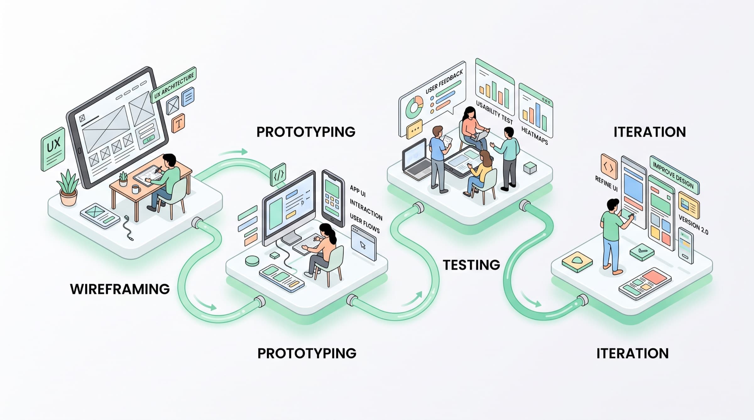
Before touching the interface, find the drop-off. Instrument the three steps between sign-up and first real use, then watch five people attempt them. You will normally have your answer inside a week, and it will be narrower and cheaper than the redesign you were about to fund.
If you cannot name the step where people give up, you are not ready to redesign anything.
Design work framed this way stops being a taste argument. It becomes a line you can defend in a board meeting: this screen costs us this much, here is what fixing it returns. That is the only framing that survives a budget review.